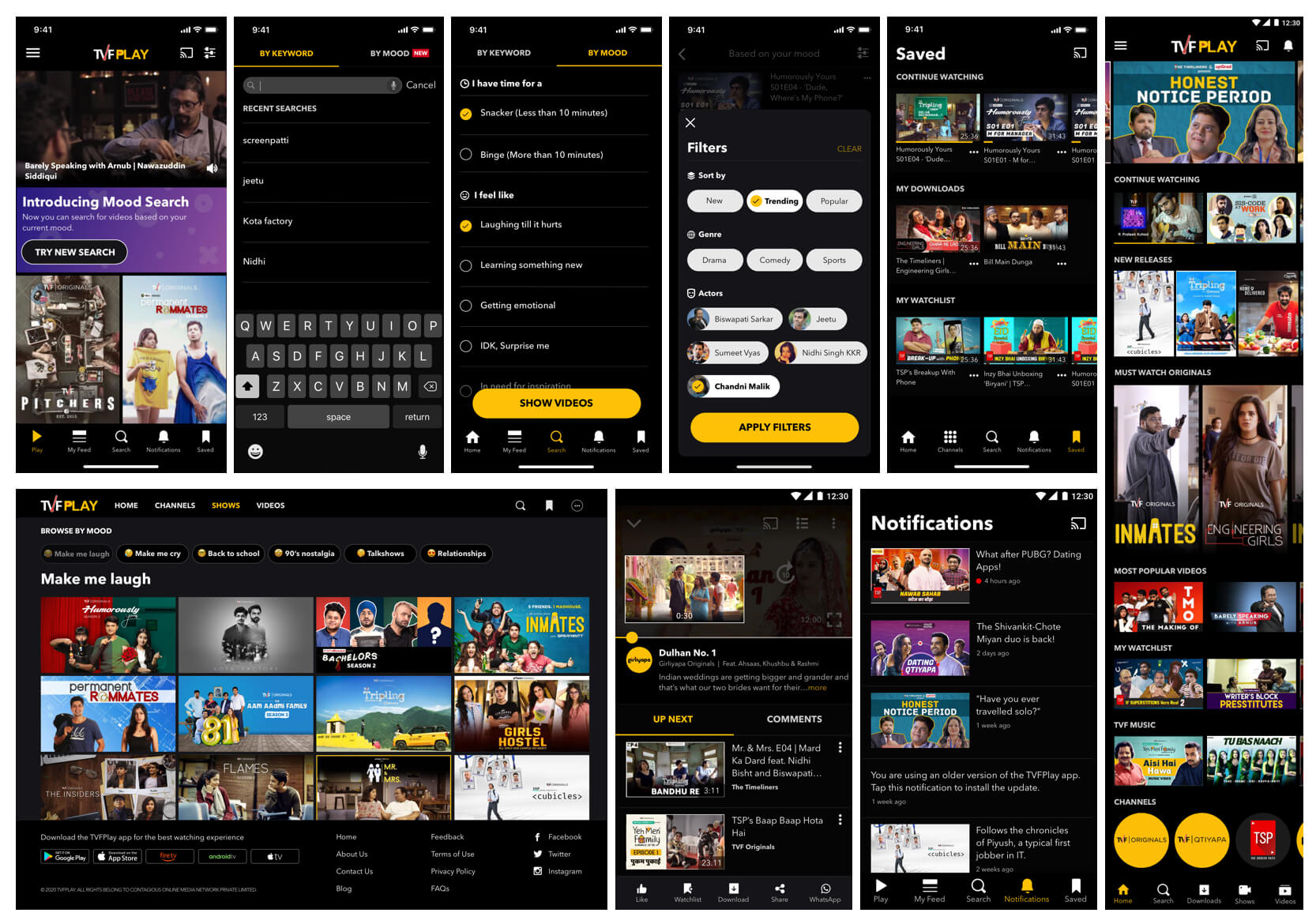
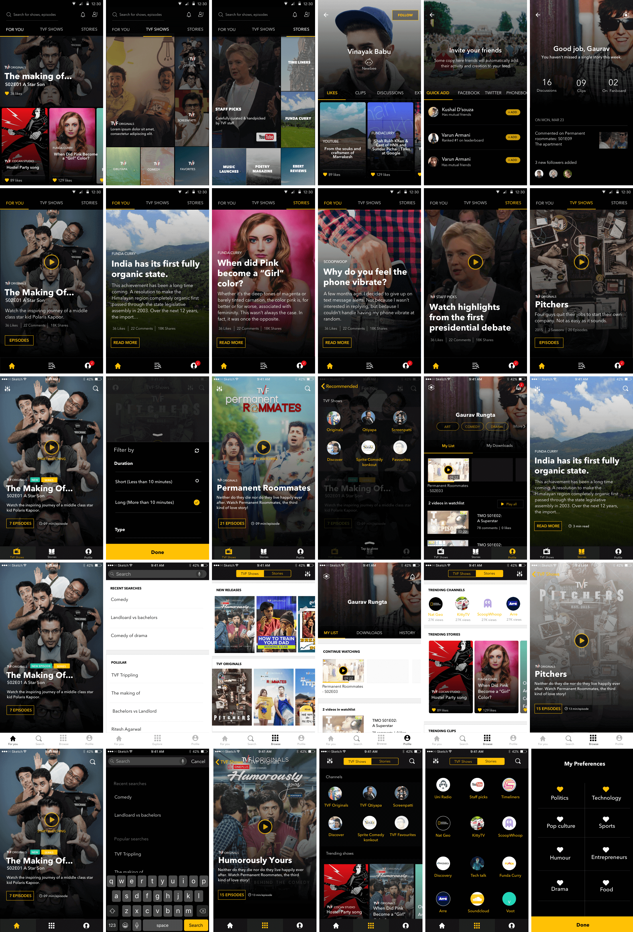
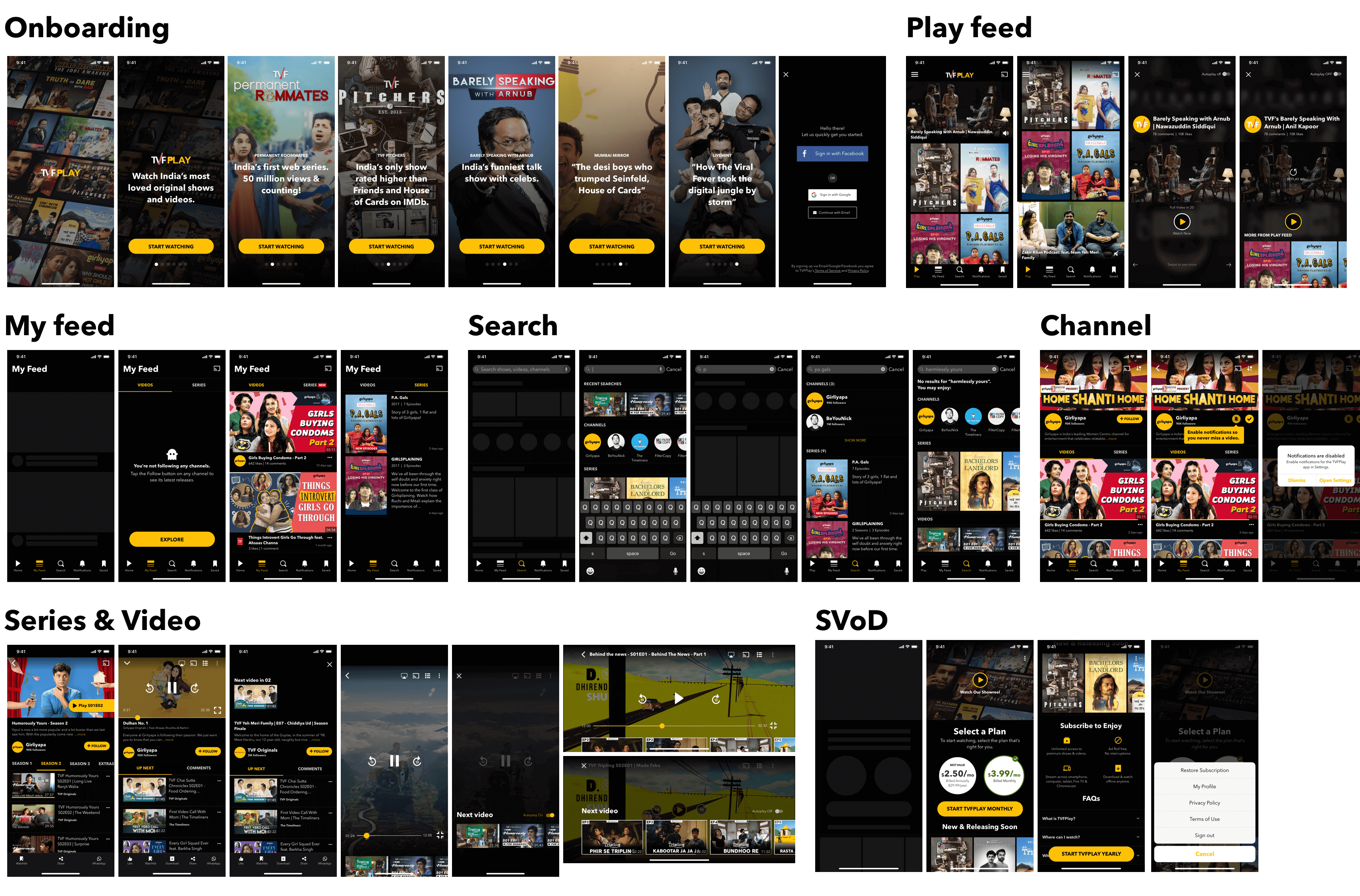
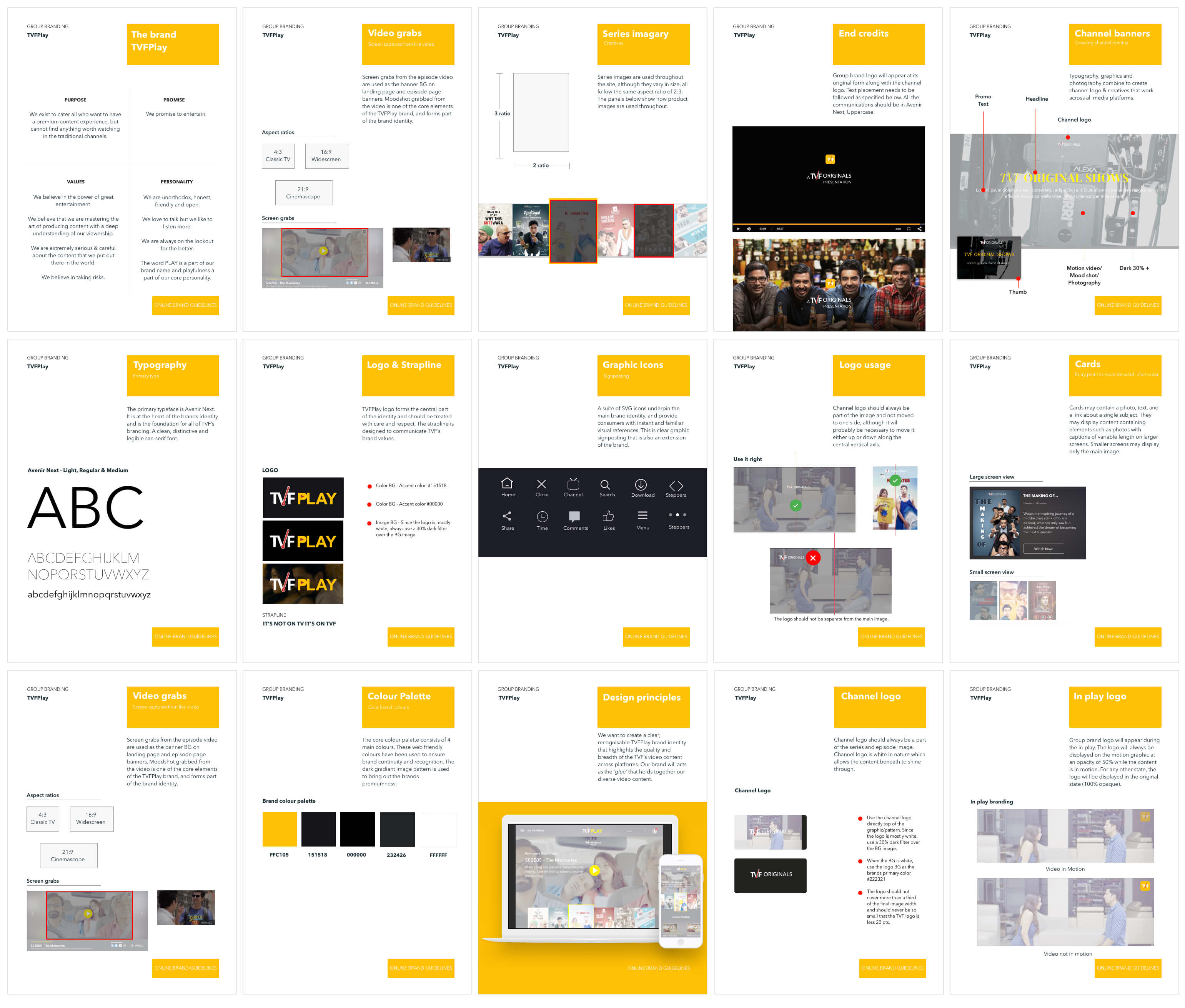
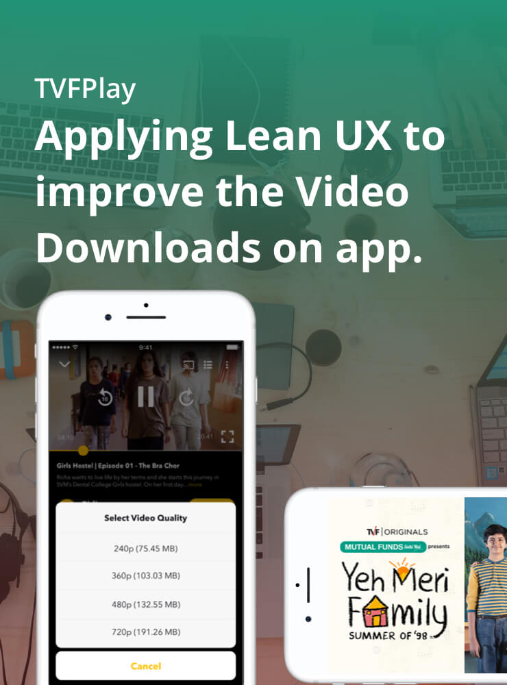
TVFPlay caters to all those who want to have a premium content experience, but cannot find anything worth watching in the traditional channels.
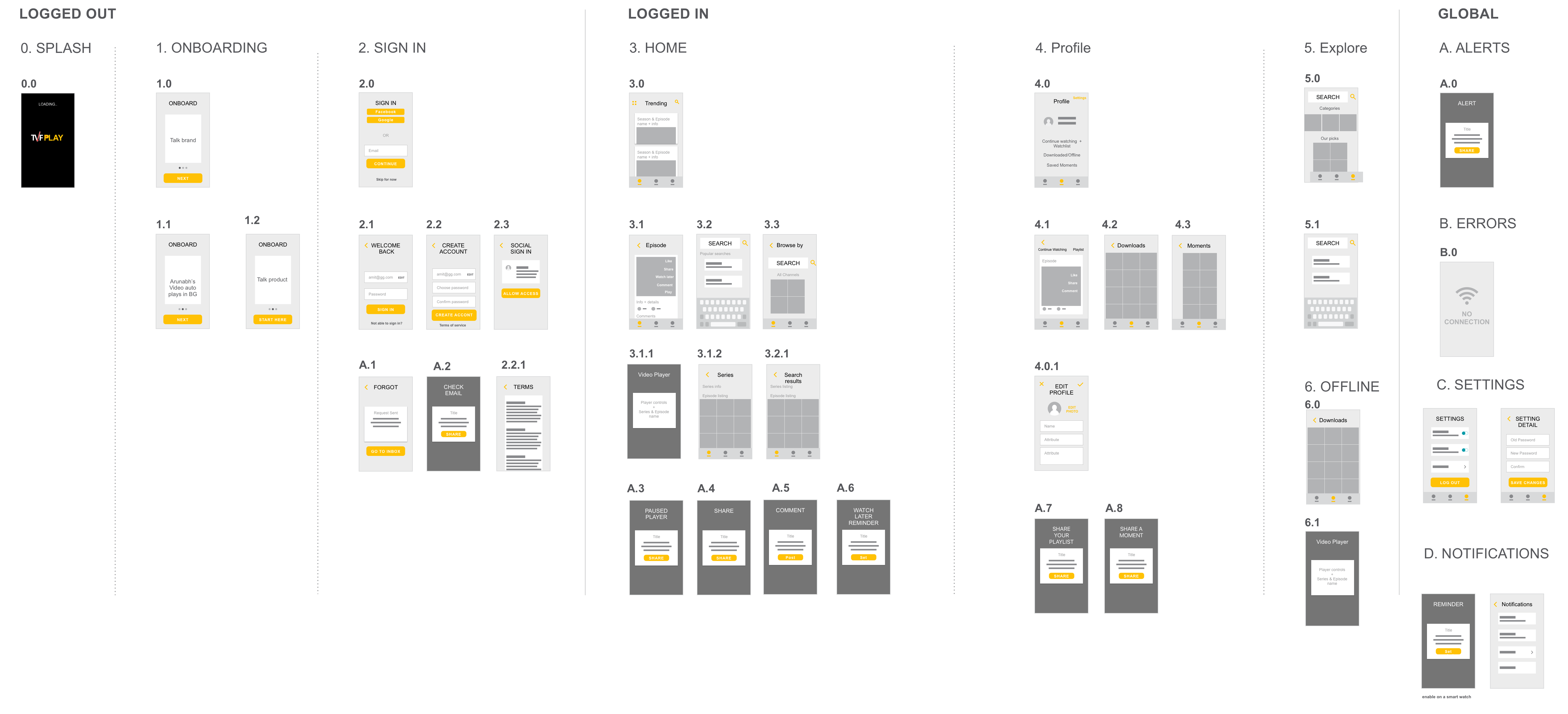
My Role
- User Research
- User Interviews
- Journey Mapping
- Wireframing
- Prototyping
- Design & Documentation
- Interaction Design
- UAT & Dev Support
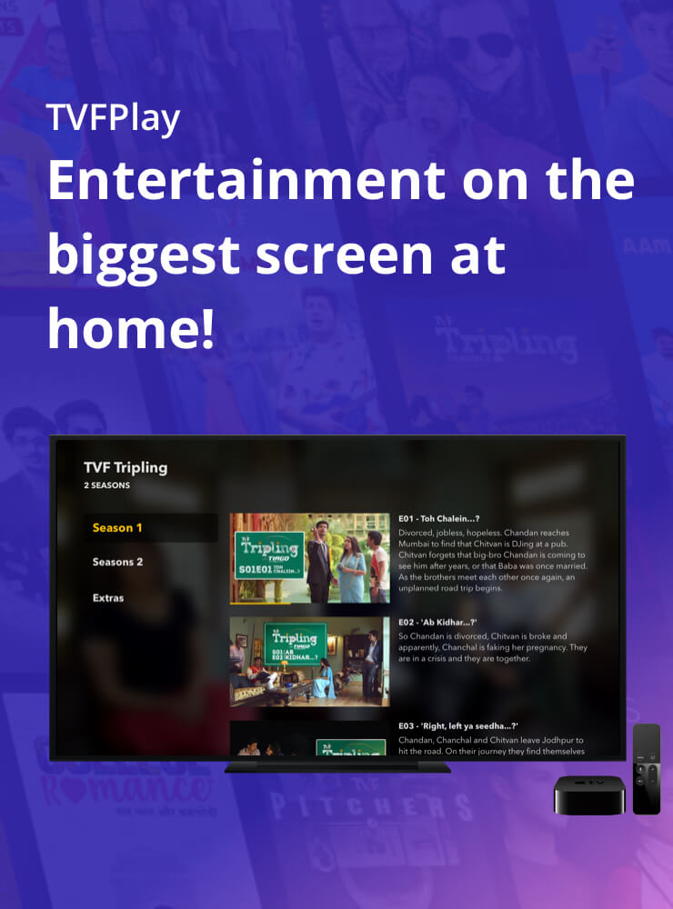
Platforms
- Android
- iOS
- Web
- Mobile Web
- Apple TV
- Android TV
- Fire TV
Year
- May 2016 - Jun 2020
Problem
Consuming content is about choice. The question we tried to answer is why should people come to TVFPlay to watch content and not on YouTube. Apart from the obvious content quality & technology angle, are there any product innovations that we can do to differentiate ourselves from the herd? How do we create the FOMO?